What I Learned from Updating my Blog Design
I have just updated the design of this blog. The old one started to look too old-fashioned, and its organization annoyed me. Indeed, there was a separation between the talks I gave and the posts I wrote. Wishing to put more emphasis on my speaker career, I had to redesign this system. On the new one, no more distinctions: all talks would be (soon) embedded in the posts flow.
That’s why I started this redesign. As my designer skills are far from being usable, I started looking for a theme for an essentially textual blog. And I found the WordPress Baskerville theme, by Anders Norén. Using Jekyll for these few pages, I had to reintegrate the whole design. It allowed me, in addition to optimizing HTML semantics and removing all unused styles, to grab a few tricks that I am sharing with you today.
A more Natural Vertical Flow with Masonry
Introducing Masonry
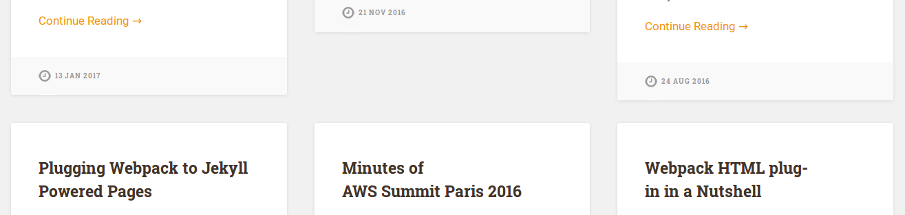
First, the home page. If we resize our browser, we notice that every post automagically reposition itself at a correct place, whatever is the post card height.
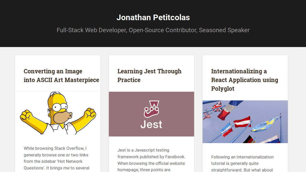
All the magic is handled by Masonry, a cascading grid layout library, available in VanillaJS version. Using it is as simple as embedding the following script:
new Masonry('.posts-list', {
    itemSelector: '.post',
});
We just need to set correct dimensions to our .post list item (only width is constrained in our case), and we are ready to go!
To provide a lighter experience for my readers, I tried to remove Masonry dependency and to check the result, either by fixing height, or by using some float properties.
Without any custom rule:
Gap is irregular, with possibility of big holes in the grid.
Fixed height:
No more hole in the grid. Yet, it requires to adapt writing to design to get a correct display. I don’t want such cumbersome and time-consuming extra work.
Floating posts:
Best solution of all, except there are some content holes in the grid.
After giving it a few tries, I’ve decided to let the extra 7.77 kB of JavaScript from Masonry lib.
Handling Image Loading
I currently display all available posts on the home page. I will probably switch to an infinite scrolling like pagination in the future, but for now, it is fast enough. Yet, it raises an issue with Masonry.
I embed a picture per post card. I can’t constraint image height on each post field, as no dimension is the same. So, post card height changes over time, once pictures are loaded. It causes an issue for Masonry, as we call it at the end of the page, without expecting every assets are loaded.
Often, all pictures are correctly loaded prior to Masonry initialization (at least on my laptop with a fast Internet connection). Yet, sometimes, loading images is slow, and we face the following glitch:
Indeed, Masonry computes each card position taking into account their height. However, at the beginning, all images have not yet loaded: post card heights are lower than expected. Once pictures are loaded, card heights are increased. However, Masonry is not aware of these changes, and still has the lower height positions in memory. We need to relaunch a Masonry layout computation to fix it. This is easily verifiable: just resize the browser, and the glitch disappears.
I am obviously not the only one having the issue, so there should be an existing solution. And indeed, there is imagesloaded. Just like its name says, this lib executes a function once all images are loaded. So, we can update our Masonry code to handle image loads:
imagesLoaded('.posts-list .picture', function () {
    masonry.layout();
});
We wait that all .posts-list .picture images are correctly loaded, and we re-render the Masonry layout. Only four lines of code to get this natural flow… Amazing! I won’t hesitate anymore before embedding Masonry in another project.
Illustrating Blog
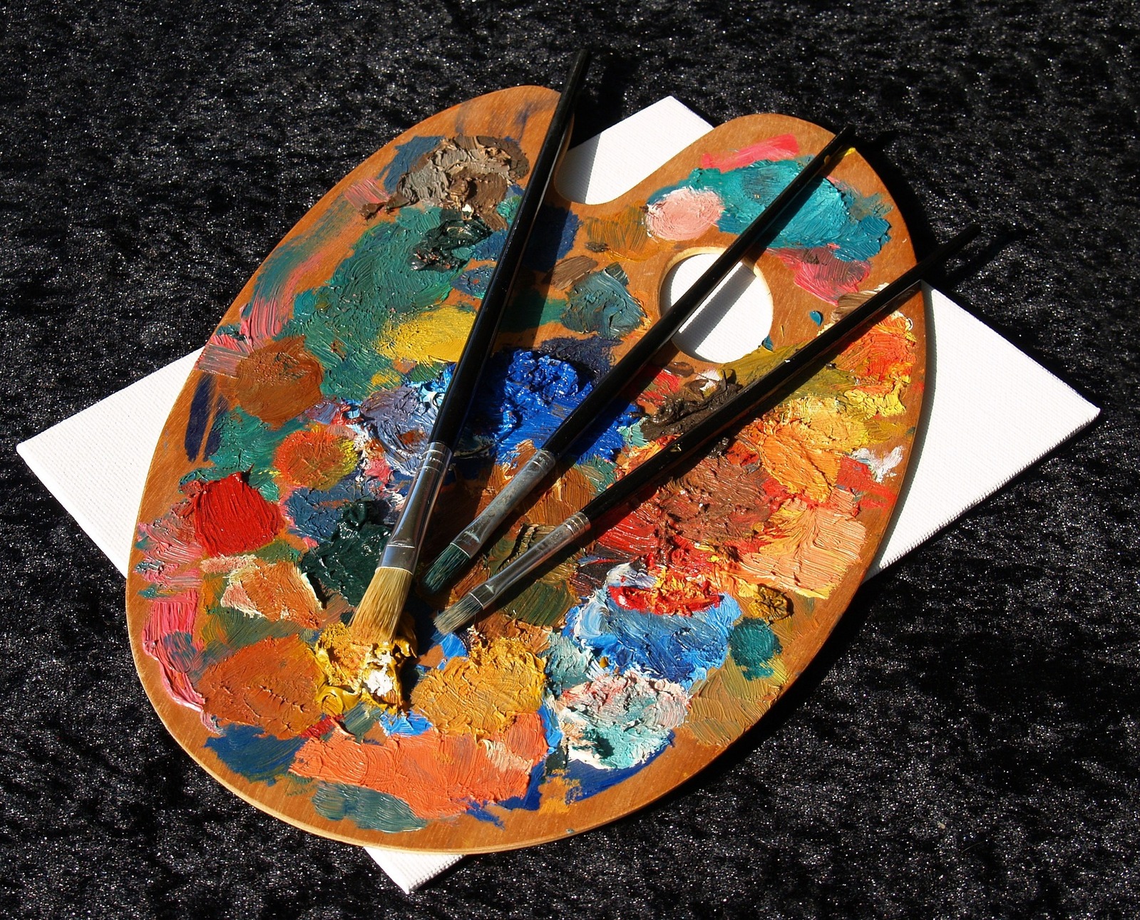
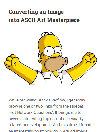
I strongly under-estimated the value provided by images. And I guess this is visible reading this highly illustrated post. Of course, it requires much work as we need to find correct pictures, and sometimes edit them.
It may look like an anxious task. How are we supposed to illustrate a post about React Native without the over-used React Native logo? Well… Just use an inspiring picture. We may always find a good reason later if we are asked. For instance, having an airplane wing for such a post isn’t obvious at the first sight. Yet, we may imagine Adrien took a flight to the exotic unkown world of React Native.
And, honestly, do we really take care of all post illustration pictures when browsing the Web? We just don’t like a huge amount of endless text.
“The world is old, they say. Well, so it is! But it is as greedy for amusement as a child!” - Jean de la Fontaine
And no need of a picture. We just need some media breaks, such as the previous quote. Mind always tries to evade from boring task. So, let’s give it a break from time to time. It would help the reader to focus on post content this way.
Triangle Arrow with Pure CSS
From a pure technical point of view, I also learned a useful tip to add a triangle arrow in pure CSS.
The arrow over the picture is in fact a div with only a top colored border. To better understand what is happening, consider a div with following style:
div {
    border: 50px solid red;
    border-color: yellow green blue red;
    width: 0;
    height: 0;
}
The result of this style property is:
Hence, every border has a trapezoidal form. If width is null, then we would have perfect triangles. This is the tip used to make triangle arrows. We just need to keep the top border, and we are done.
If we look carefully at the previous arrow, we can notice a subtle border at the bottom of the arrow. This relief is achieved using the following code:
.title-wrapper {
    position: relative;

    &:before, &:after {
        content: '';
        display: block;
        border: 12px solid transparent;
        position: absolute;
        left: 10%;
        bottom: 0;
        margin-bottom: -24px;
    }

    &:before {
        border-top-color: #eee;
        z-index: 10;
    }

    &:after {
        border-top-color: #fff;
        z-index: 11;
        margin-left: 1px;
        margin-bottom: -21px;
    }
}
The margin-bottom property helps to move the arrow outside the title container, just above the below picture. It would probably be better to move this code to target the picture directly, but done is better than perfect, right? ;)
Subtle Image Effect with Scale Transition
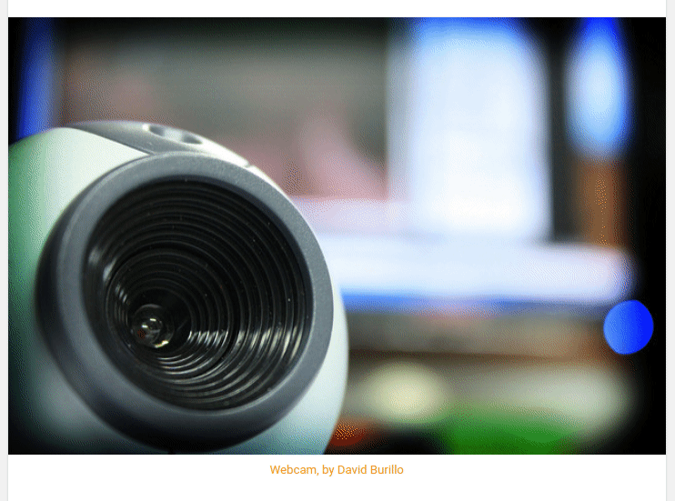
Another great way to improve user experience is to add subtle animations to our site. We are all used to see some color transition when hovering a link. But, how can we tell our user a picture is clickable? There are a lot of interesting effects when hovering an image. I took the original theme effect: a light zoom on the picture.
This is done in only a few lines of CSS:
img {
    transition: all 0.3s ease-in-out;
    &:hover {
        opacity: 0.8;
        transform: scale(1.1);
    }
}
And, according to the feedbacks I received, this simple effect brings some “Woah!” effect:
Can't stop zooming on Homer
— Kmaschta (@Kmaschta) 17 février 2018
Making an animation feel natural is sometimes tricky, as we need to handle a chain of animations. However, in this case, the animation is simple and provide a great way to improve look and feel of the blog. An easy win I will probably reproduce in the future.
Responsive Cover Picture and Iframes
While speaking about pictures, I spent some time figuring out how to make a responsive cover image to my posts, without specifying any height.
The solution I chose was the simpler one:
img {
    width: 100%;
    max-width: 100%;
    height: auto;
}
The responsive part comes from the max-width set to 100%. It ensures our picture won’t overflow outside picture container.
That was the easy part. I also embed iframes at several places of the blog (for instance on the AWS Summit Paris 2016 Minutes to embed some slideshows). I always hated to give a specific width and height attributes as advised by all Embed this buttons. Indeed, it doesn’t fit well on a full responsive website.
After digging around this issue, I finally found the (almost) perfect solution. Just wrap your content in a div (the extra markup caused the almost) and apply the following CSS rule:
div {
    position: relative;
    width: 100%;
    height: 0;
    padding-bottom: 56.25%;

    iframe {
        position: absolute;
        top: 0;
        left: 0;
        width: 100%;
        height: 100%;
    }
}
We set an absolute iframe to take the whole parent space. However, the WTF part relies on the container div: null height and a magic 56.25% bottom padding… It wasn’t obvious before reading Creating Intrinsic Ratios for Video post from Thierry Koblentz that 56.25% = 9/16. Hence, the iframe would have an aspect ratio of 16/9, which is universal enough for my needs.
But, why setting a null height? height percentage values would be relative to the parent element. Yet, padding percentage is relative to the parent width. Brilliant!
Optimizing Social Network Share
Having a nice picture helps to make our content more visible in all social network feeds. Hence, taking care of the final render is important. And, icing on the cake: it just consists in adding a bunch of metas.

Here is a list of all required metas to get a similar result:
<meta property="og:title" content="{{ page.title }}">
<meta property="og:description" content="{{ page.excerpt }}">
<meta property="og:image" content="{{ page.illustration }}">
<meta property="og:url" content="https://www.jonathan-petitcolas.com{{ page.url }}">
<meta name="twitter:card" content="summary_large_image">
Here are the Facebook (og:) and Twitter (twitter:) metas used to optimize sharing experience. An interesting fact is that Twitter allows to substitute OpenGraph (og) metas for its own use. Hence, no need to repeat ourself for common fields.
We can check if we implemented these metas correctly using the Twitter Card Validator and the Facebook Share Validator.
Conclusion
Integration is not always the most interesting part of a developer life. However, diving hunder the hood of some CSS experts technic was really interesting, and give me the motivation required to finalize this new design. A big thanks to Anders Norén for providing the raw material you currently watch!